Modal
Color
Refer to the button for primary and secondary button styling in the transactional modal.
| Class | Property | Color token |
|---|---|---|
.bx--modal-container | background-color | $layer |
.bx--modal-header__label | text color | $text-secondary |
.bx--modal-header__heading | text color | $text-primary |
.bx--modal-content | text color | $text-primary |
.bx--modal-close__icon | fill | $icon-primary |
.bx--modal-close:hover | background-color | $background-hover |
| Overlay | color | $overlay |
Typography
Modal titles and labels should be set in sentence case. Keep all titles and labels concise and to the point. Modal labels are optional.
| Class | Font-size (px/rem) | Font-weight | Type token |
|---|---|---|---|
.bx--modal-header__label | 12 / 0.75 | Regular / 400 | $label-01 |
.bx--modal-header__heading | 20 / 1.25 | Regular / 400 | $heading-03 |
.bx--modal-content | 14 / 0.875 | Regular / 400 | $body-long-01 |
Structure
| Class | Property | px / rem | Spacing token |
|---|---|---|---|
.bx--modal-close | height, width | 48 x 48 | – |
.bx--modal-close__icon | height, width | 16 x 16 | – |
.bx--modal-header__label | margin-bottom | 4 / 0.25 | $spacing-02 |
.bx--modal-header | padding top, padding left | 16 / 1 | $spacing-05 |
.bx--modal-header | margin-bottom | 16 / 1 | $spacing-05 |
.bx--modal-content | padding-left | 16 / 1 | $spacing-05 |
.bx--modal-content | padding-right | 20% | – |
.bx--modal-content | margin-bottom | 48 / 3 | $spacing-09 |
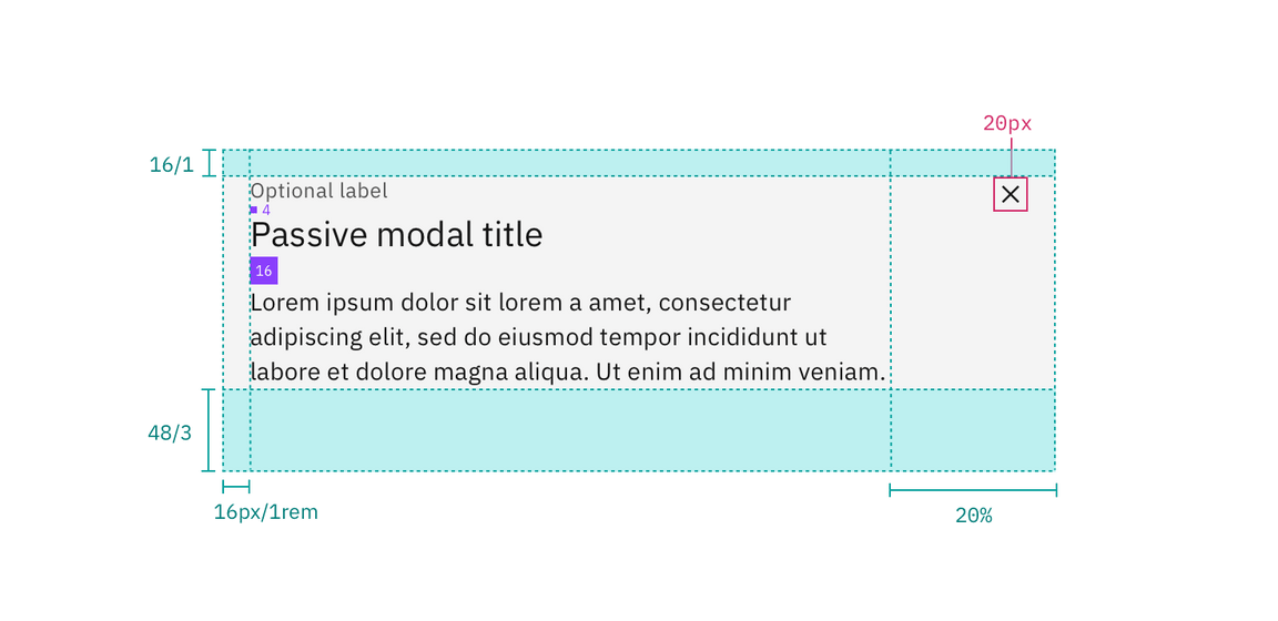
Structure and spacing measurements for a passive modal | px / rem
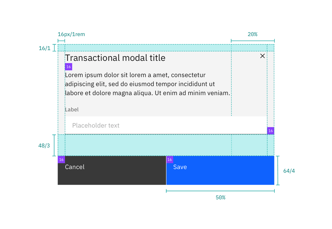
Structure and spacing measurements for a transactional modal | px / rem
Margin-right
Modals that are 36% width and larger have a margin-right: 20% (margin
percentage is based off the width of the modal window). If the modal is smaller
than 36% then it has a fixed margin-right: 16px/1rem. Body copy, including
titles, in a modal always follows the 20% margin-right rule. However, inputs and
other components may still expand to the full width of a modal window.
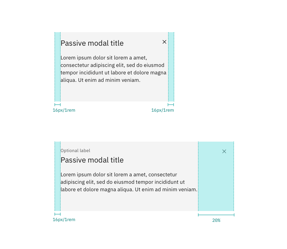
Margin-right for modals less than 36% (left) and greater than 36% (right).
Sizes
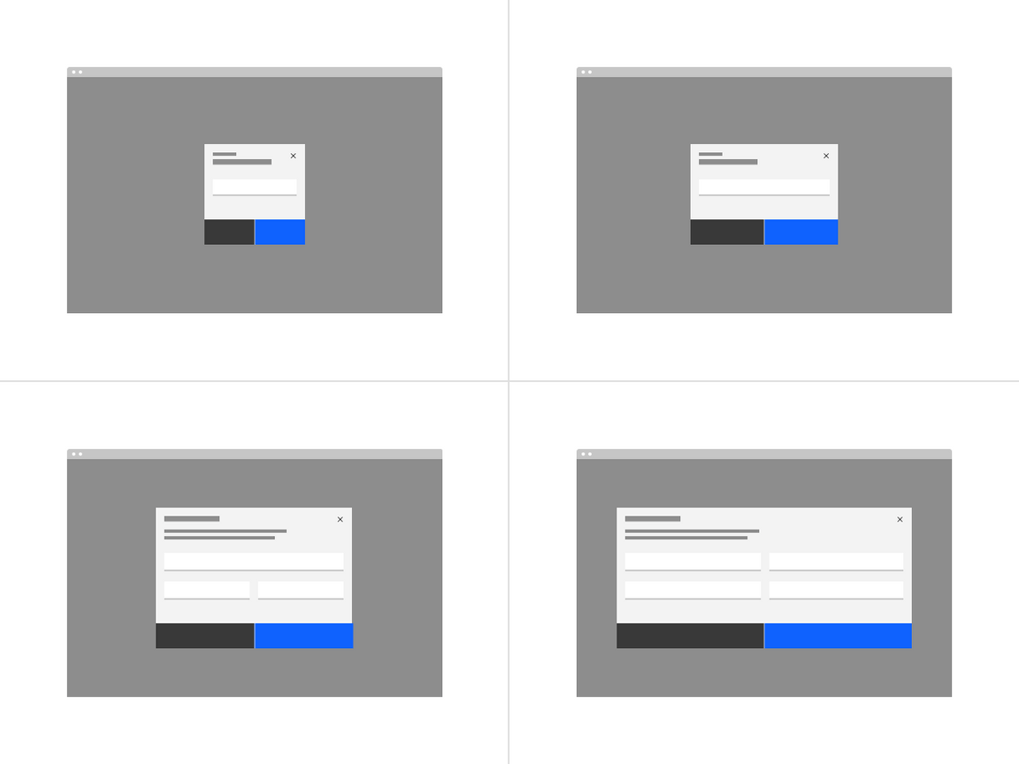
There are four modal sizes: extra small, small, medium, and large. Each modal size has a responsive width that changes based on the browser size. As the browser decreases, the modal width percentage increases thus maintaining a proper ratio between the modal and browser. Modal widths are defined as percentages of the browser but will still align to columns on the 2x grid.
Extra small (xs)
| Breakpoint | Percentage width | Column span | Margin-right |
|---|---|---|---|
| 1584 | 24% | 4 of 16 | 16px / 1rem |
| 1312 | 24% | 4 of 16 | 16px / 1rem |
| 1056 | 32% | 5 of 16 | 16px / 1rem |
| 672 | 48% | 4 of 8 | 16px / 1rem |
| 320 | 100% | 4 of 4 | 16px / 1rem |
Small (sm)
| Breakpoint | Percentage width | Column span | Margin-right |
|---|---|---|---|
| 1584 | 36% | 6 of 16 | 20% |
| 1312 | 36% | 6 of 16 | 20% |
| 1056 | 42% | 7 of 16 | 16px / 1rem |
| 672 | 60% | 5 of 8 | 16px / 1rem |
| 320 | 100% | 4 of 4 | 16px / 1rem |
Medium (md)
| Breakpoint | Percentage width | Column span | Margin-right |
|---|---|---|---|
| 1584 | 48% | 8 of 16 | 20% |
| 1312 | 48% | 8 of 16 | 20% |
| 1056 | 60% | 10 of 16 | 20% |
| 672 | 84% | 7 of 8 | 20% |
| 320 | 100% | 4 of 4 | 16px / 1rem |
Large (lg)
| Breakpoint | Percentage width | Column span | Margin-right |
|---|---|---|---|
| 1584 | 72% | 12 of 16 | 20% |
| 1312 | 72% | 12 of 16 | 20% |
| 1056 | 84% | 14 of 16 | 20% |
| 672 | 96% | 8 of 8 | 20% |
| 320 | 100% | 4 of 4 | 16px / 1rem |
Max sizes
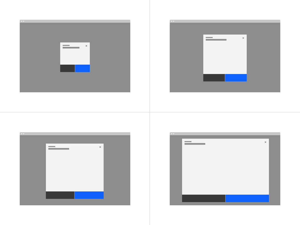
Each modal size has a max height in order to maintain a proper window ratio.
| Modal size | Max-height |
|---|---|
| Extra small (xs) | 48% |
| Small (sm) | 72% |
| Medium (md) | 84% |
| Large (lg) | 96% |
Mobile
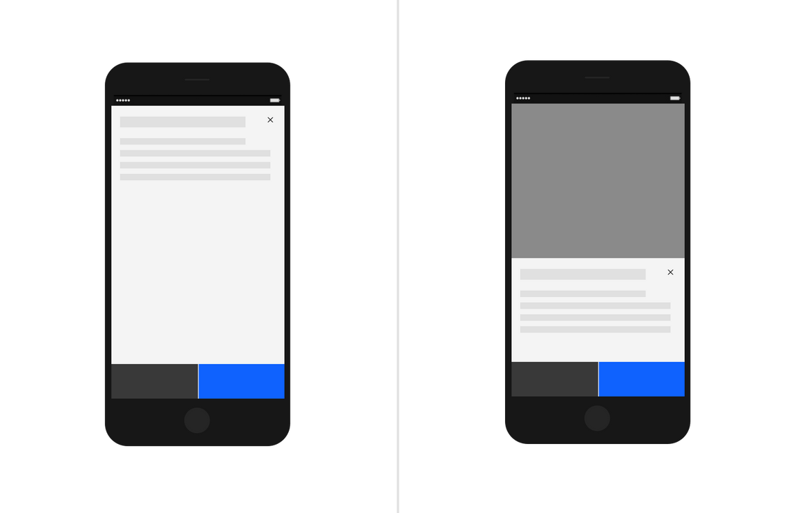
On mobile devices, at the smaller break points the max-height does not apply. The height may either be 100% of the screen or maintain the height defined by the content while sticking to the bottom of the mobile screen.
